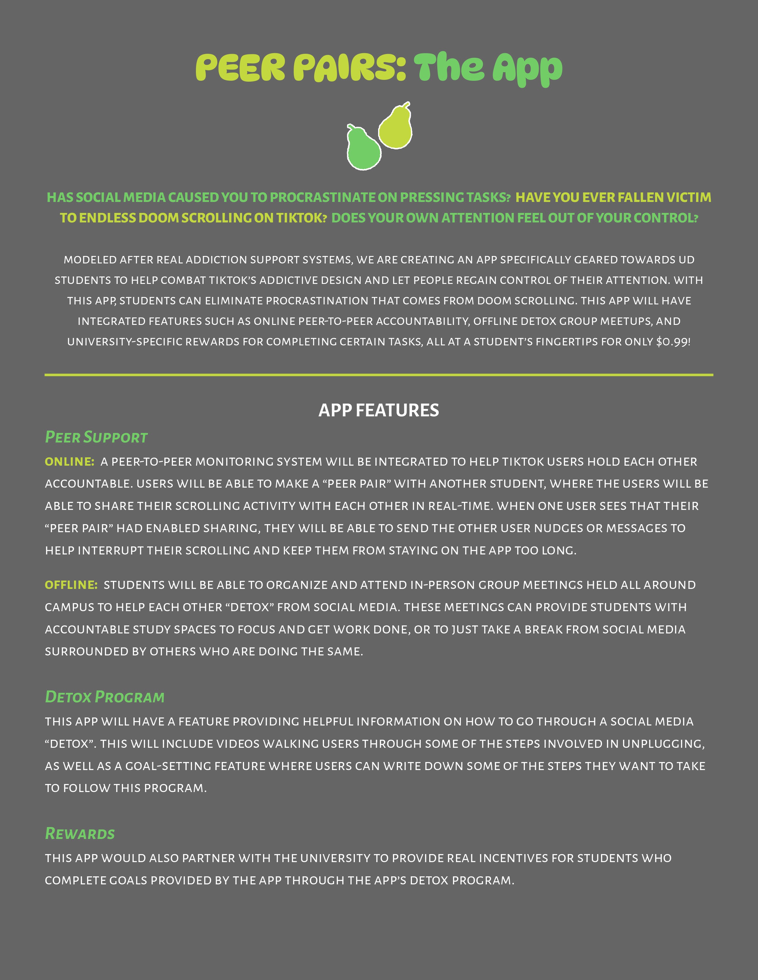
In this project, my team and I created and pitched a prototype for an app that would help combat social media addiction among students. This project was completed with fellow undergraduate student Gracy Sudha Hasitha Dasari. Below are the details of our design process including our user research phases, wireframing and early prototyping iterations, our final product, and my takeaways from this project.
Figma, Qualtrics, user research, wireframing, prototyping, survey design, usability testing, qualitative coding, app design
As part of our user research phase of this project, we aimed to identify some of the underlying causes for social media addiction. This way, when we began to formulate a solution, we would be able to tackle this problem at its root in our solution. I surveyed a pool of 22 students through Qualtrics to gauge some of their social media habits and impressions, specifically focusing on TikTok; you can click here to be taken to the survey.
When designing this survey, I decided to make a majority of the questions open-ended so we could receive unique responses from each participant. Then, I qualitatively coded the responses we received to turn them into meaningful results.
These were our key findings:
77% of respondents preferred their TikTok For You page over their Following page, with the most commonly cited reasons being that it feeds them constant new content, and that the algorithm shows them videos tailored to their interests. This points to two reasons for this social media addiction that we could focus on in our solution.
73% of respondents have either considered deleting social media but didn’t, or have deleted social media, but redownloaded it. This showed us that while people may have difficulty disconnecting themselves from social media, there is still a desire to do so.
The top reasons respondents gave for why they may struggle to exit the TikTok app after opening it were that it’s immersive and easy to get sucked into, it doesn’t take much effort to focus on (multiple people said it lets you “turn off your brain”), it’s hard to stop scrolling once you start, and the short videos and endless content keeps you constantly entertained.
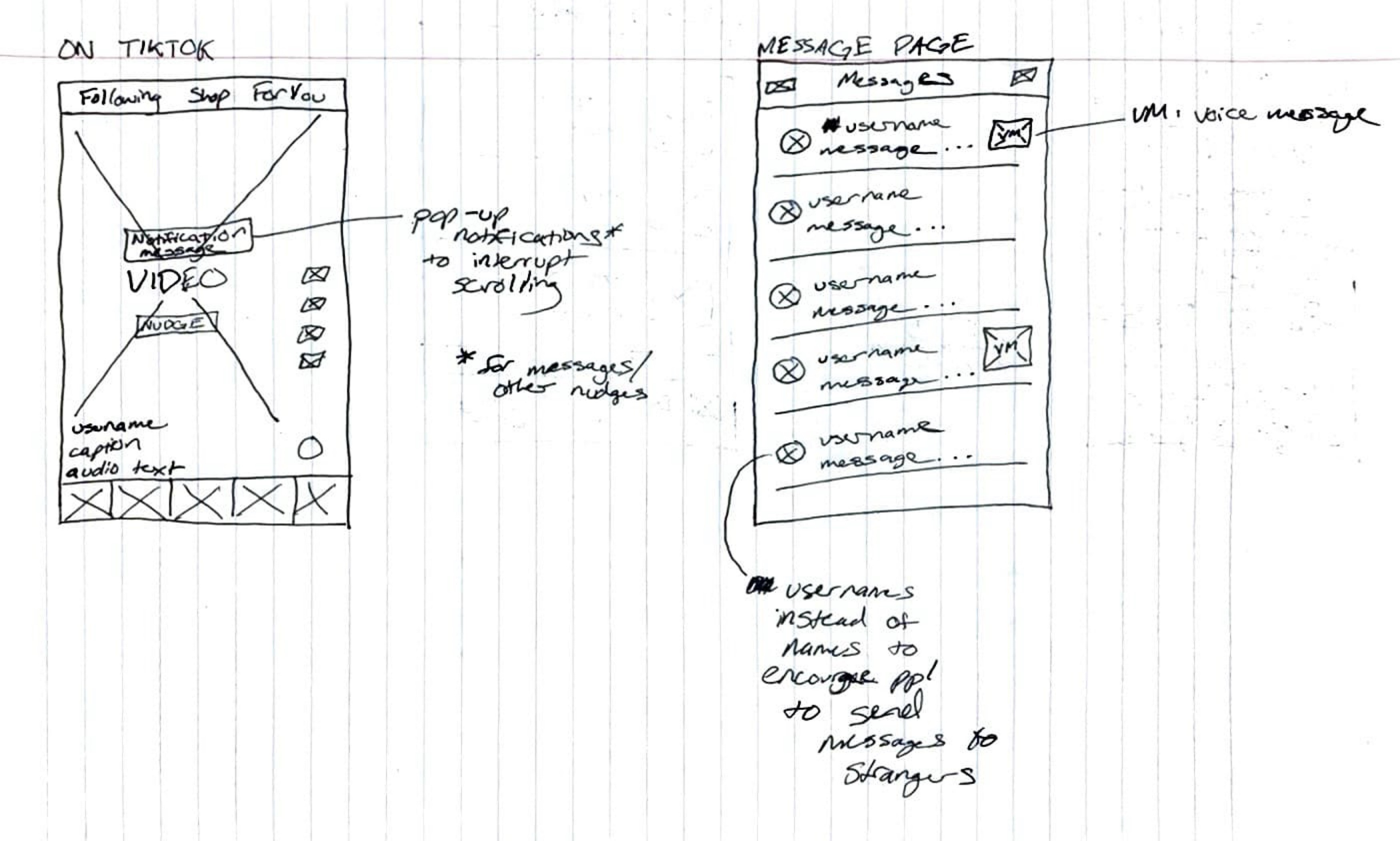
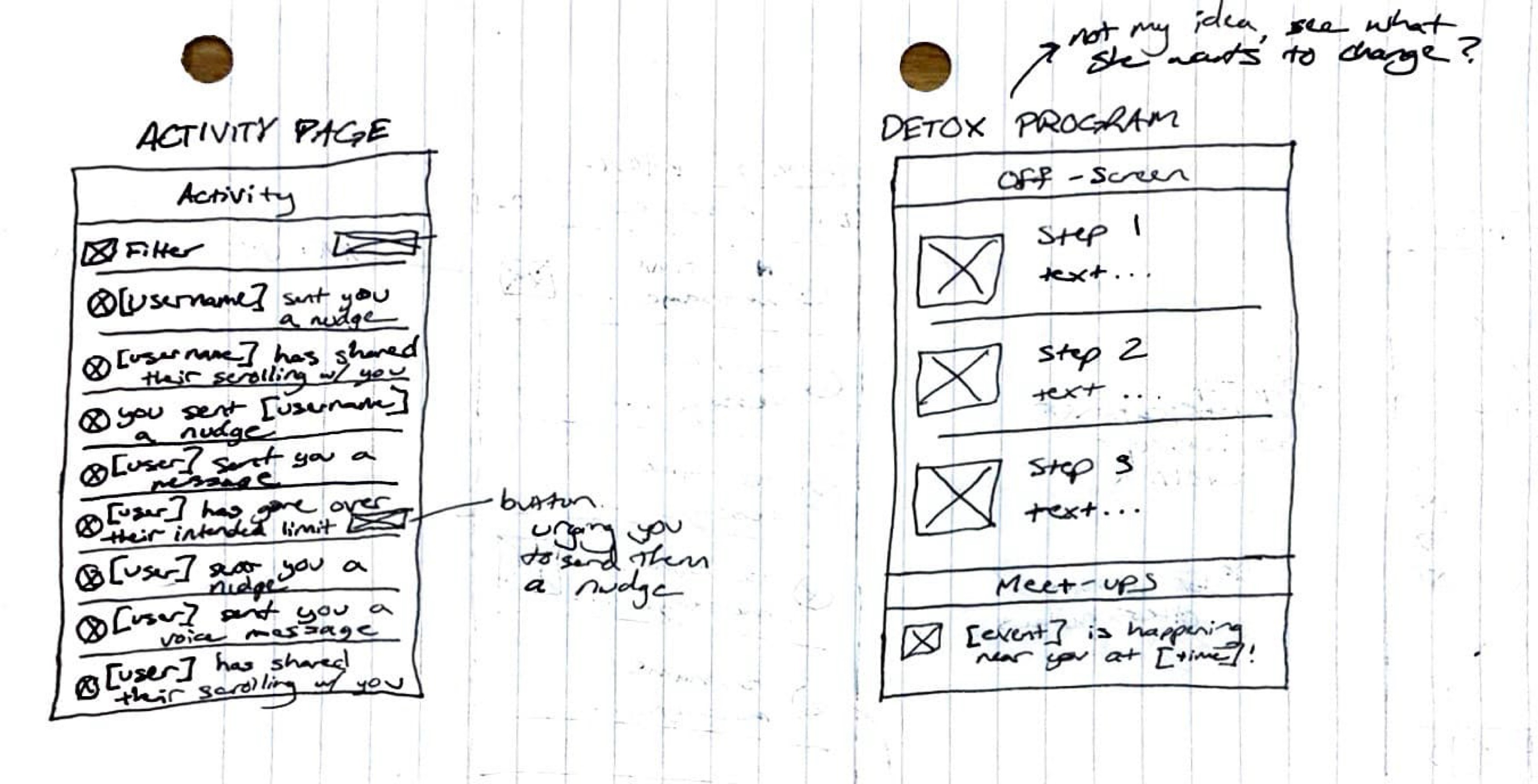
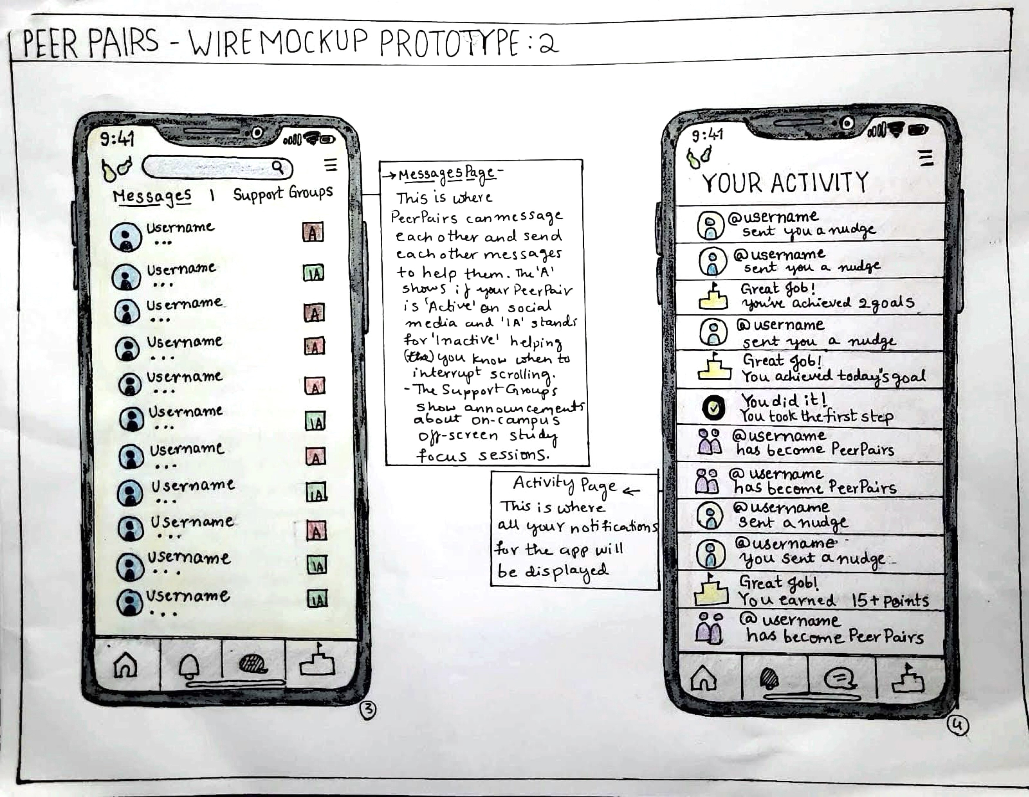
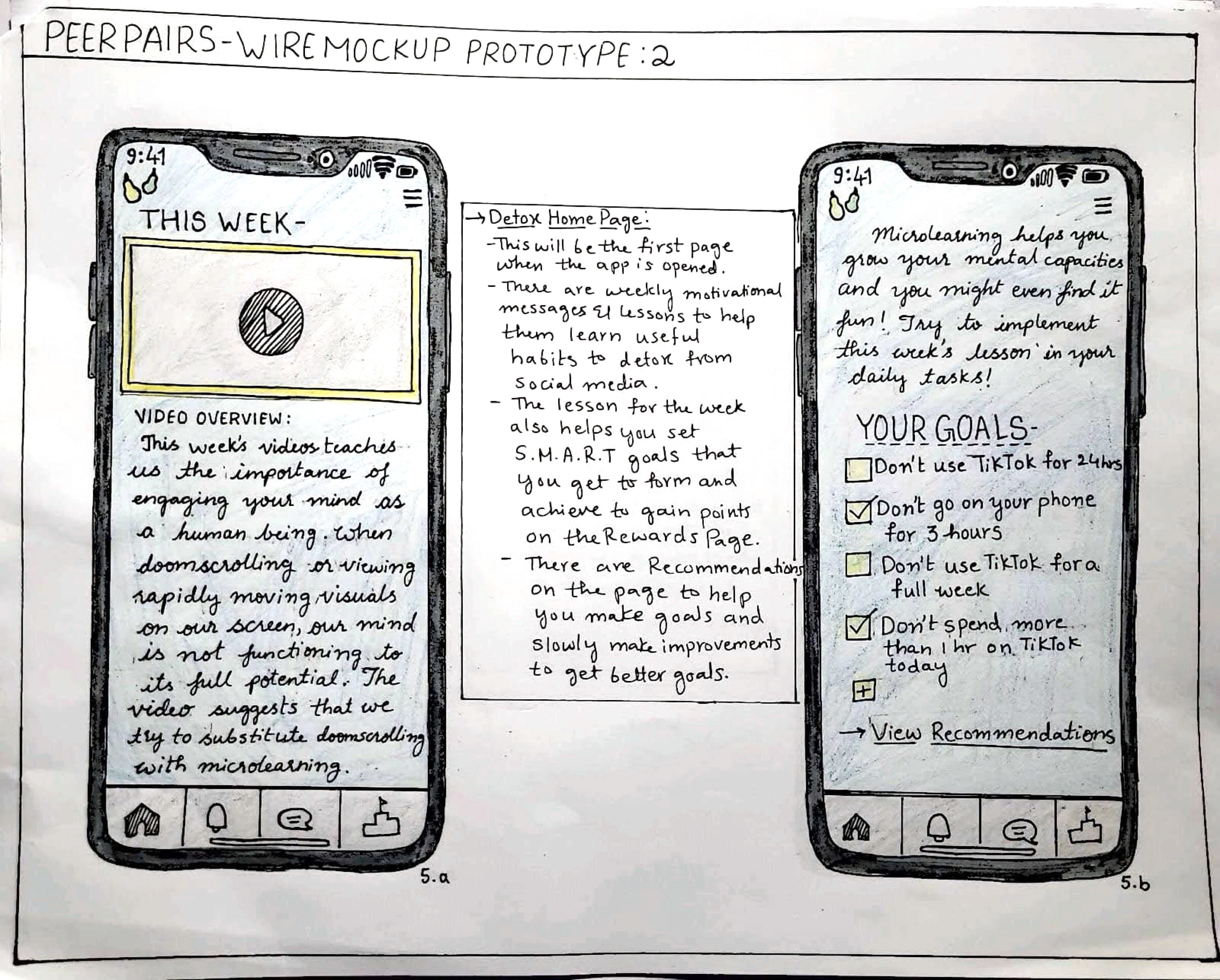
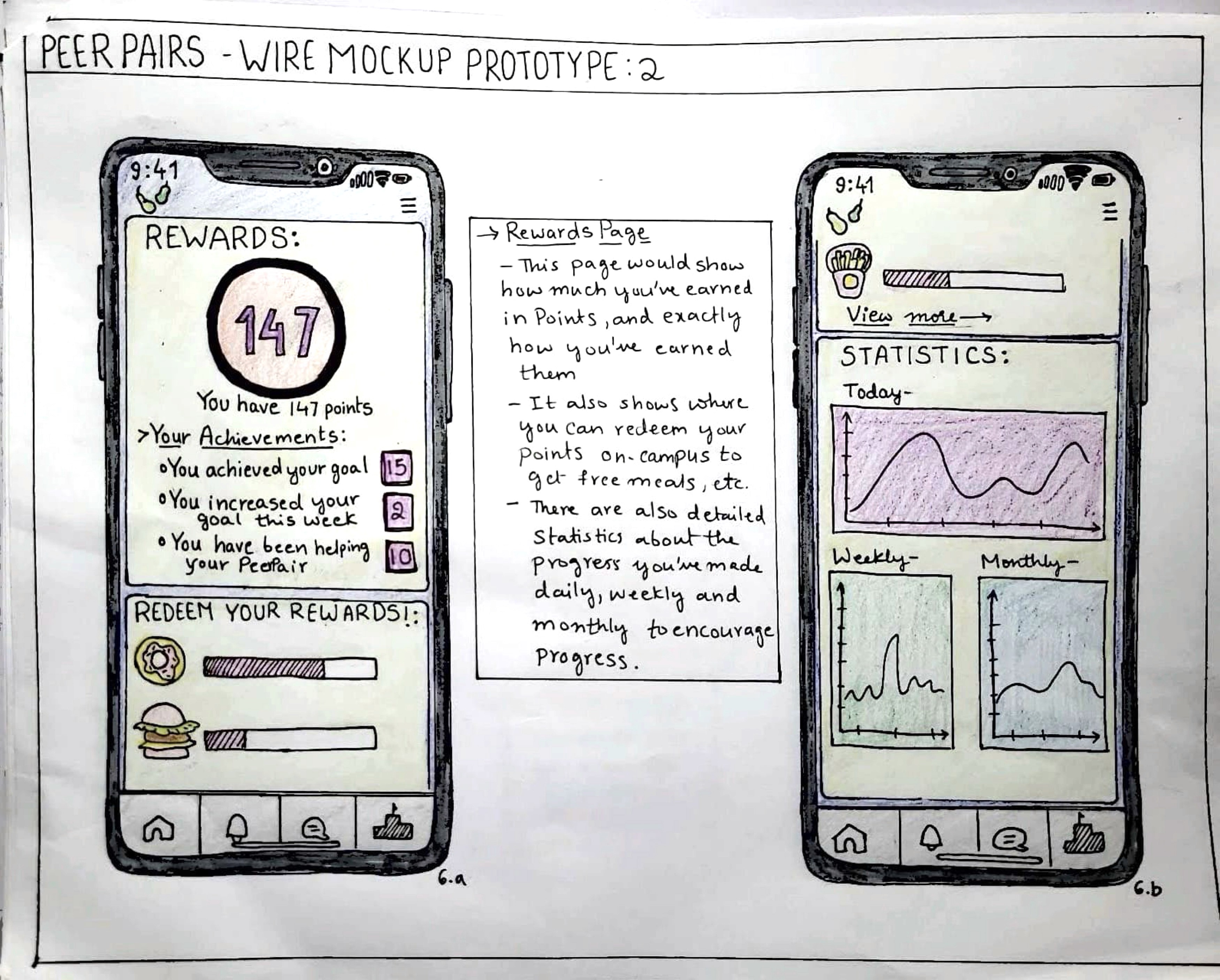
WIREFRAMING
I ran usability testing sessions on our high-fidelity mockup with 5 different people. During these sessions, I presented users with the mockup and asked them to simulate a series of tasks without direction, observing their actions to see how they would complete each task. During these simulations, I urged users to describe what they were doing and explain any difficulties they would run into. Running these testing sessions allowed us to get feedback on our app design and get a sense of its ease of use, so we could have a direction for improved future iterations.
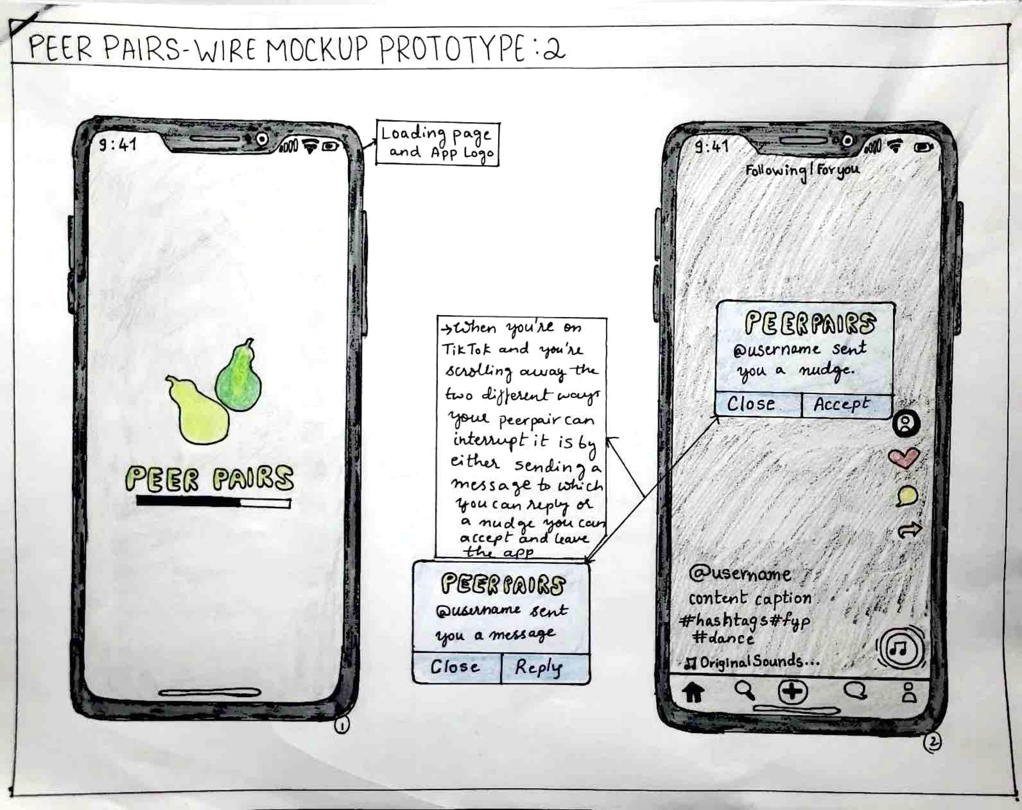
PROTOTYPING
After receiving feedback from the testing sessions of our mockup, we made minor modifications to our app design and began prototyping. I built a Figma prototype of our final app design, which can be accessed here or used below. The design file for this prototype can also be accessed here or used below.
We presented a pitch of this app concept and prototype as a solution to help combat social media addiction. In addition to pitching, we wrote a project report detailing our full design process, which can be accessed here.
TAKEAWAYS
Through our design process we developed many different iterations of our app, starting out with a concept-based information sheet, turning that into visual wireframes and mockups, and eventually creating an interactive prototype. Translating our idea into different mediums gave us a wide scope of perspectives on the app, ranging from its conceptual appeal to the details of its functionality. This also led to a diverse range of feedback on the app, which we used to gradually improve it with each new iteration.
The thing that proved to be most valuable for us was receiving continuous feedback from people during every phase of our design process. Through our surveying, information sheet, wireframe testing, and the final prototype, we were able to learn more about our potential users and how this app would serve them. This helped us validate our app, ensuring that it would be user-centered and effectively address the root causes associated with social media addiction.
Framer 2023
Amsterdam